The Objective
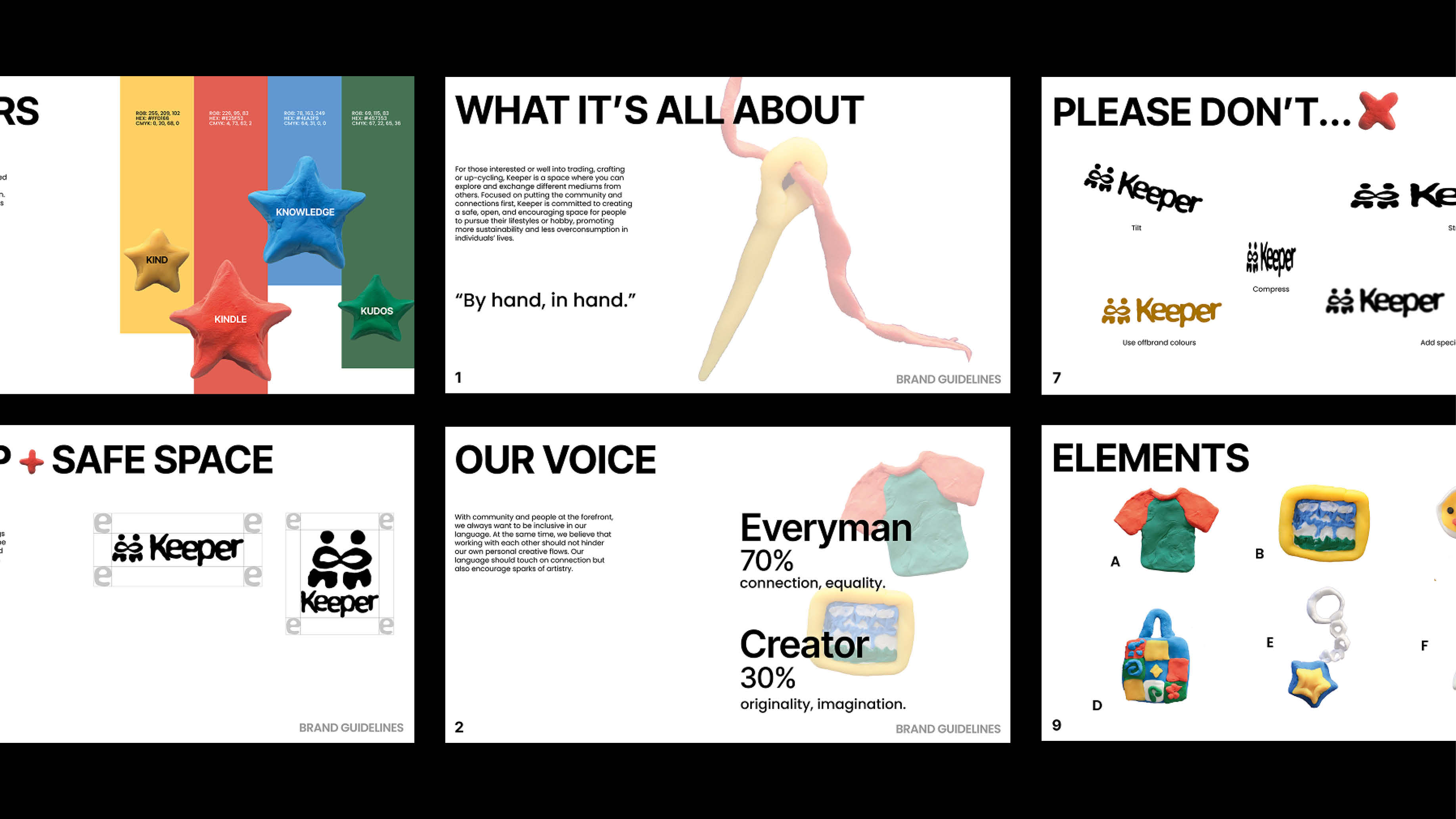
To design a brand that puts people first with an emphasis on creativity and learning, while removing barriers to ensure accessibility. Participate in sustainability and reducing waste generation through recycling and reuse.
The Execution
Keeper’s logomark visualizes people intertwining or exchanging hands to represent the infinity sign. A symbol of the cycle of resources, connections and the earth, the infinity ties deep into the brand’s sustainability goal.
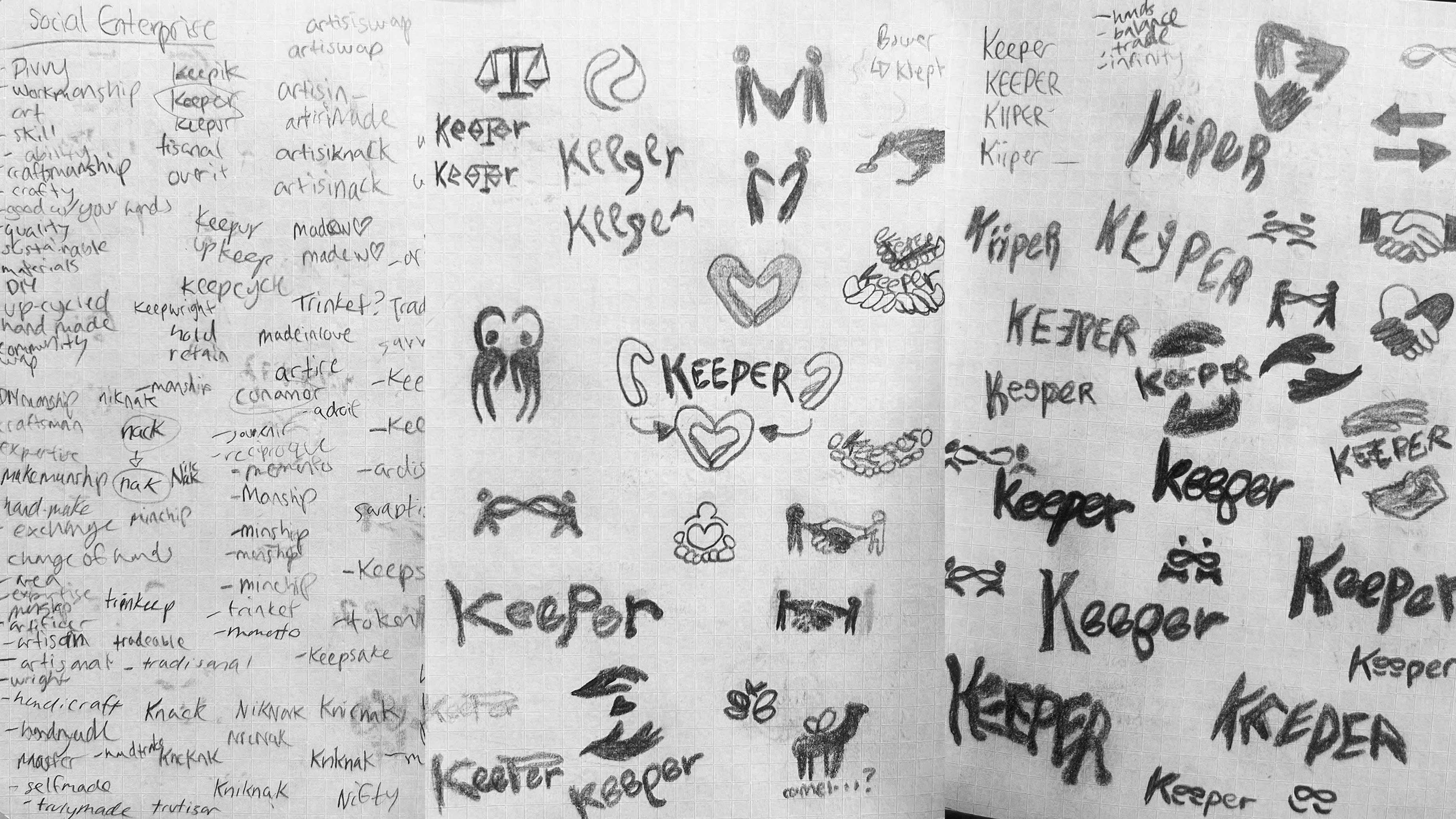
Keeper was initially designed with vibrant colours and solid, organic shapes. However, the role of creators and crafters were not sufficiently established, sending the brand through a redesign to fully encompass their vision.

The Result
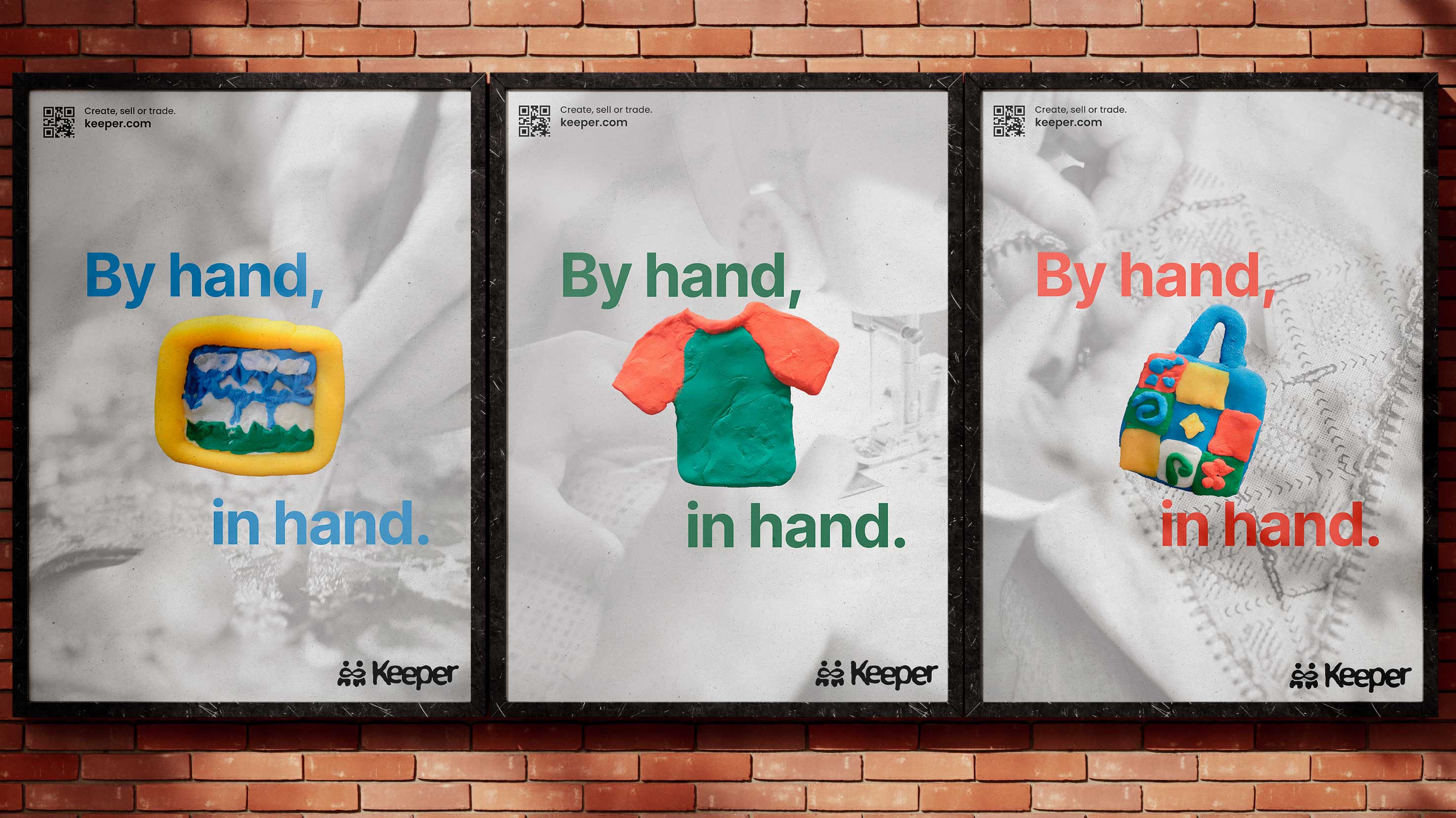
A quietly playful concept with inviting language. For crafters, artists, up-cyclers or traders who are looking for a more refreshing way to give and receive items. The slogan, “By hand, In hand,” recognizes the important role that each individual plays throughout the process, from creation to collection.
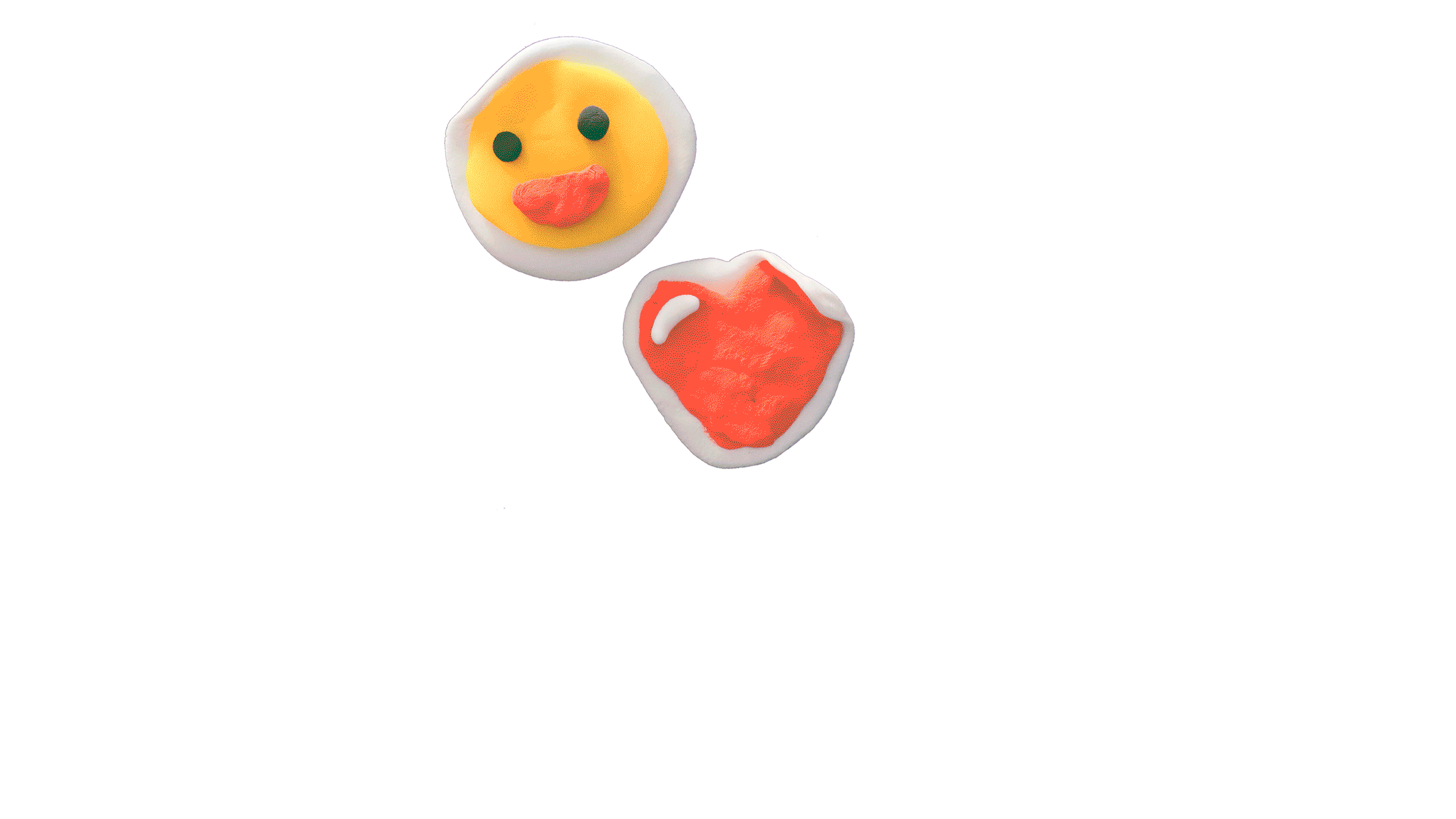
Clay is utilized in the elements for Keeper, a medium that is molded and shaped by hands. The imprint of fingerprints are left all over the clay, emphasizing the human touch in the creative process.